Colour & Palette
Choosing the Right Colour Palette for an Ethiopian Wedding
How to build a palette that flatters your venue, your attire and your photographs — without losing cultural warmth.
Start with what can't change
Your venue's walls, floors and natural light, and the colours of your traditional attire, are fixed. Choose a palette that sits comfortably with them rather than fighting them.
White and ivory habesha kemis pair beautifully with warm neutrals; coloured tilf borders can become the accent you repeat in florals or napkins.
Use the 60–30–10 rule
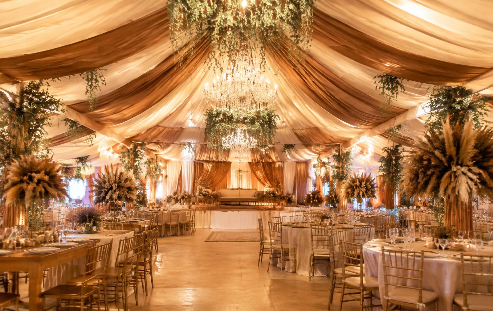
Let one calm colour carry most of the room (often ivory or cream), a second support it (caramel, olive or blush), and a small accent bring sparkle — champagne gold works well here.
Restraint is what makes a room feel expensive. Too many strong colours compete in photographs.
Test in real light
Fabric looks different under daylight, warm bulbs and camera flash. Ask to see samples in the light your event will actually have, especially for evening receptions.
Bring your family in early
Weddings are shared celebrations. Agreeing on two or three colour directions with key family members early saves decisions later and keeps the design cohesive.
Images shown are design concepts illustrating our style, not photographs of specific client events.