Colour & Palette
Olive Green and Ivory: A Timeless Event Design Combination
Why this calm, natural pairing photographs so well, and how to keep it from feeling flat.
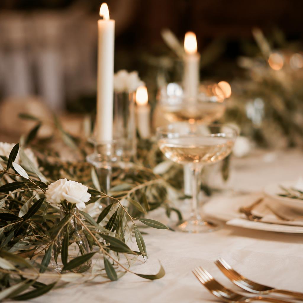
Why it works
Olive is a quiet, grounded green that echoes real foliage, while ivory adds softness and light. Together they feel natural, peaceful and quietly luxurious.
Add texture, not more colour
The secret to this palette is texture: linen, raw silk, pampas grass, eucalyptus, wood and woven baskets. Varied surfaces keep a two-colour room rich and interesting.
Where to place the green
Use greenery in runners, arches and stage backdrops where it frames people. Keep table linens light so faces and food stay the focus.
A touch of warmth
A little champagne gold or caramel — in candle holders, chargers or chair details — stops the palette from feeling cool in evening light.
Images shown are design concepts illustrating our style, not photographs of specific client events.